Our own controls. No packages, no licence keys.
Stratumworx.UI is the library of Windows Forms controls every Stratumworx program is built with: a ribbon window with its File page and command search, tabs, a navigation pane, a grid with filters and grouping, a tree grid, a workflow diagram, a calendar, the editors, toasts, fourteen themes and 195 pictures of our own. It takes no packages, so nothing in it needs a licence, a key or a nag screen.
See every control Get the library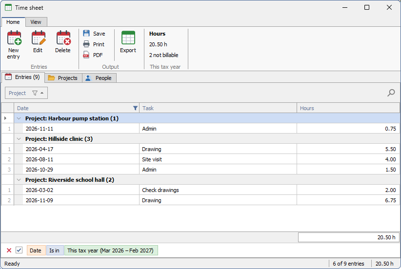
Windows' behaviour, our drawing
Buttons, check boxes, lists and trees are the standard Windows controls painted over, so the keyboard, default and cancel buttons, mnemonics and accessibility stay Windows' own. Only the drawing is ours.
Drawn, not stacked
The ribbon, the tabs and the grid are drawn by the control itself rather than built from child windows. A ribbon page with forty commands costs one window, and a grid draws only the rows on screen, so 20,000 rows cost what 30 do.
Every colour in one file
StratumTheme holds every colour, font and size the controls draw with. Nothing else in the library holds a colour, so the look changes in one place.
A grid you can filter, group and total
Bind a list of objects, a DataTable or a DataView. A column is made for each field, and a column you have set up keeps its caption, width and format when the data is replaced.
- Auto-filter row under the headers: type, and the rows narrow as you type. Text is
“contains”; numbers and dates take
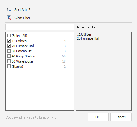
=<>>>=<<=. - Header funnel: the column's values as a ticked list, with a search box and (Select All). On a number column it adds conditions: Between, Top N, Bottom N, above or below average, worked out again against the rows the other filters leave.
- Find panel, Ctrl+F: every word must be found somewhere in the row, and the matches are highlighted in the cells.
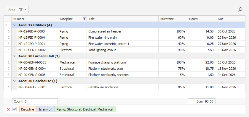
- Filter panel along the bottom: the filter in chips, a tick to switch it off without losing it, and a red × to clear it.
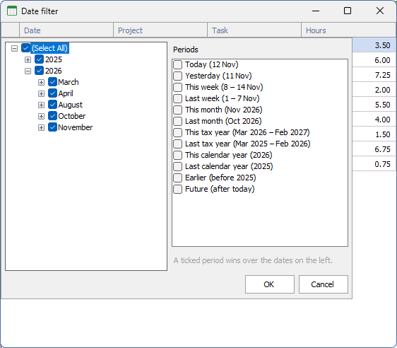
A date column's funnel opens its dates as a Year › Month › Day tree to tick, beside a list of periods: today, yesterday, this and last week, month, tax year and calendar year, earlier, and future. Each period shows its dates — “This tax year (Mar 2026 – Feb 2027)” — and is worked out against today every time, so “This month” moves on by itself. A ticked period wins over the ticked dates.
The tax year starts in March by default, as the South African tax year does. An application for somewhere else sets the starting month once at start-up. “This year” and “Last year” read as calendar year, so they are never taken for the tax year.
Drag a header into the group panel to group by it, at as many levels as you like. Group rows carry their count, rows are numbered from 1 within each group, and the footer under a column gives its Sum, Min, Max, Count or Average.
Right-click a header to sort, group by, hide, best-fit, or open the column chooser — a ticked list of every column. Drag headers to reorder them. The whole arrangement saves to a string and comes back, and a column the saved layout never heard of keeps its own settings.
Cells open their editor on click, F2, Enter or typing; Escape puts the old value back and Tab moves on. Tick columns toggle in place. A screen can refuse to open an editor, refuse a value with the sentence saying why, and hear every change. Over a DataTable it can offer a new-row line at the foot and Delete for the selected rows.
Ctrl+C copies the clicked cell, or the selected rows tab-separated so they paste into a spreadsheet as rows and columns. Cut-off text shows in a hint. A screen can colour whole rows or draw a cell itself, and add virtual columns worked out from each row.
What the grid shows — the rows after filtering, sorting and grouping, and the totals over them — is worked out by GridDataView with no window at all, and checked against answers worked out by hand.
Every control, and what it does
Read from the source, control by control. Every picture is the control itself, drawn with sample data in the Light theme — click one to see it full size.
Windows and layout
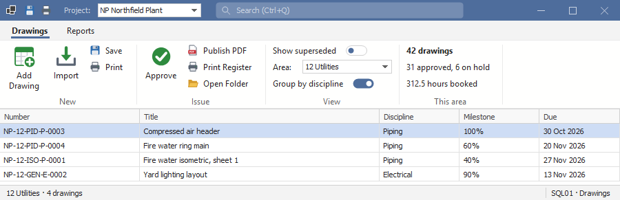
The title bar is drawn into the ribbon: pinned Quick Access buttons, items of the program's own (a project picker here), the command search, and minimise, maximise and close — while Windows still does the dragging, snapping and resizing. The ribbon holds pages of captioned groups: large and small buttons, menu buttons, on/off switches, editors with a caption, and live figures that the screen keeps up to date. Groups fold into a single button when the window gets narrow, and keytips reach every command from the keyboard.
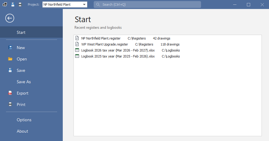
Office's File page for a ribbon window: it covers the window under the title bar, with a coloured list on the left — a back arrow, then Start, New, Open, Save, Export, Print, Options, or whatever the program adds — and the chosen page on the right.
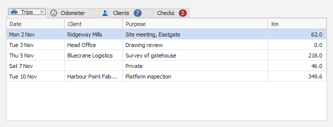
A strip of tabs with the chosen one lifted and joined to its page. Each tab can carry an icon, a live count and a close button, and Ctrl+Tab moves between them from anywhere inside.
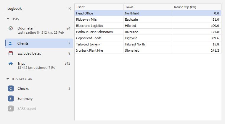
Groups with headings that fold, items with a count or a short summary — “18 412 km business, 71%” — and the chosen one marked with an accent bar. The whole pane folds to a narrow strip.
Text panels divided by thin lines, one of which can spring to fill the room left over; a panel can be coloured or hold a progress bar, and can be updated from any thread. The zoom bar is Excel's: “−”, a slider with 100% in the middle, “+” and the per cent.

A plain container with the theme's grey line when a border is asked for. Made collapsible, it folds to a narrow strip with its title, and opens again with a click.
Every dialog's window: the theme's font and colours, Windows' own title bar tinted to match on Windows 11, and one application icon set for every window at start-up.
Data
Sorting, multi-select, the four filters (including number conditions and the date filter with tax-year periods), grouping with row numbers per group, footer totals, detail rows under a row, formatting rules, saved layouts, editing, new and deleted rows, copy to the clipboard, and columns that fit the grid or run past its edge with a scroll bar.
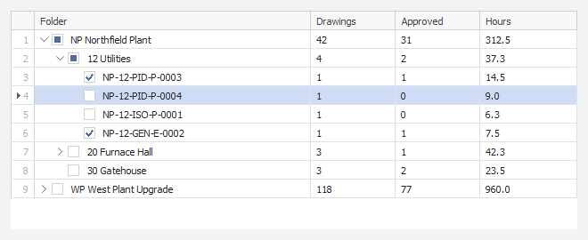
The first column is the tree — chevrons, indents, ticks and pictures — and the others are values read from each node. Children can load when a node first opens, so a large tree costs nothing until it is used.
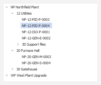
A real Windows tree, painted over: a thin chevron for the plus box, the light selection blue, and Windows' own keyboard, scrolling and hints.
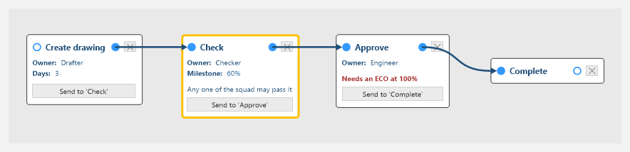
Cards for the steps, with in and out connector dots, label rows, notes and a Send button for each route; thick arrows between them. Drag or the wheel pans, Ctrl+wheel zooms, a right-click opens properties, and a read-only mode shows a running job.
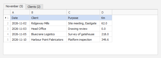
One tab per sheet, column letters across the top, row numbers down the side. What you see is what is read, so a cell corrected here is the value imported.
A column's values with their counts, a search box and (Select All) on the left; on the right, everything ticked so far, whatever the search shows.
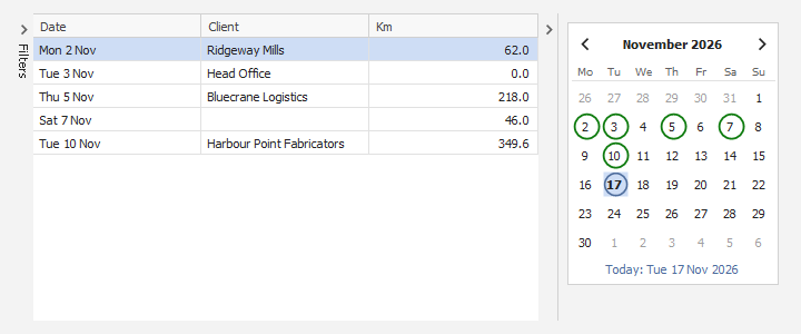
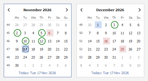
A month calendar drawn in the theme, in place of Windows' own, which stays light in a dark theme. One month or several, week numbers, today ringed, a day or a range chosen, and circled or shaded days that each carry a note.
Editors
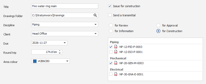
StratumTextBox for one line or several; StratumButtonEdit, a text box with a button at its right (…, a magnifier, a folder); StratumCombo, to pick from a list or type into it; StratumDate with its calendar; StratumSpin for a number with its unit; StratumColorPicker, a swatch and its #RRGGBB; StratumCheck; StratumRadioGroup, round buttons in one column or several; and StratumList, which can tick, group and show a picture beside each row. They share one frame, so they line up and look alike, and each can show that a value is wrong, with the reason.
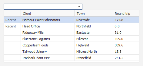
Holds a record's ID and shows its name. The drop-down is a small grid with several columns, typing narrows it on every column shown, and the ones chosen last come first.
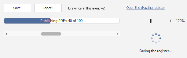
StratumButton, StratumLabel and StratumLink; StratumProgressBar, filled to its value with your words on it, or running back and forth when how long is not known; StratumWait, a turning ring laid over a control while slow work runs; StratumZoomBar; and StratumScrollBar, in the theme rather than Windows' light grey.
Pop-ups and dialogs
The search box in a ribbon window's title bar (Ctrl+Q): type part of a name and run the command, with its page and group beside it and the ones used last at the top.

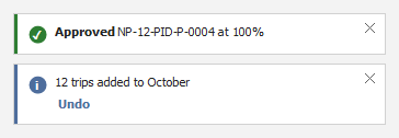
Slides into the bottom-right corner — “Saved”, “12 trips added” — with an optional action such as Undo, and fades. It never takes the focus, so typing carries on, and it stays while the mouse is over it.
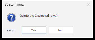
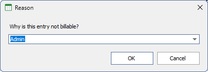
The same arguments and answers as Windows' message box, so a call moves over by changing its class name. The input box returns what was typed; given choices, it becomes a drop-down you can still type in.
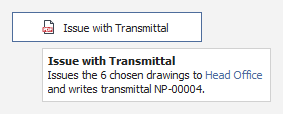
Tooltips in the theme's colours that can carry a bold title, colour and line breaks, wrapping long text at a set width.
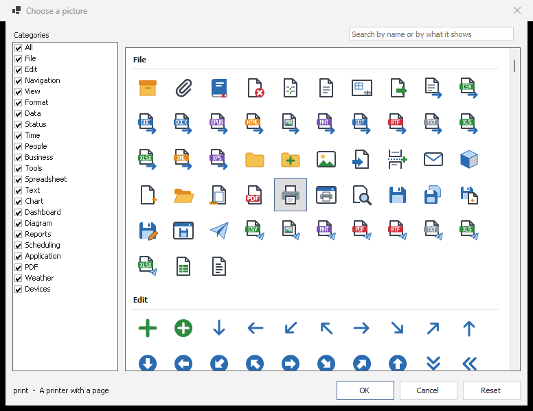
Every picture in the library by category, with a search box, for choosing an item's picture in the Visual Studio designer.
Themes, pictures and text
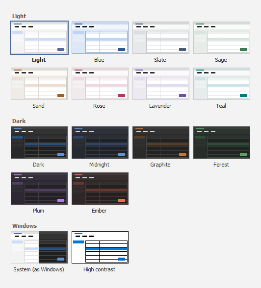
Every colour the controls draw with is held in one place. Eight light themes — Light, Blue, Slate, Sage, Sand, Rose, Lavender and Teal — six dark ones — Dark, Midnight, Graphite, Forest, Plum and Ember — System, which follows Windows' light or dark setting, and High contrast. A theme changes every open window at once, and the choice is remembered by every Stratumworx program on the machine. The gallery shows each theme as a small window in its own colours.
Original SVG pictures for the common commands — file, edit, print, view, formatting, data and charts, status, people and business — drawn at any size in the theme's colours, with no package, and picked by name.
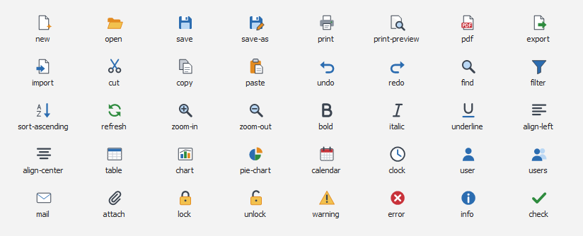
Icons drawn in code on a 16-unit grid and scaled to the size asked for, so a 32-pixel icon is as sharp as a 16-pixel one, with badges for what a button does: add, delete, star, edit, blocked.

Labels, buttons, tabs, grids, trees, lists, the status bar and tooltips can show bold, italic, underline, colour, size, line breaks and pictures from StratumImages, from a small set of tags. A tag it does not know is shown as written, so a stray “<” never swallows the words after it.

A control that draws its own parts — a ribbon, a grid, a calendar — lists them for screen readers, each with a name and a role, so Narrator, NVDA and JAWS read more than one blank box. Every control shows where the focus is.
What it needs
- Framework
- .NET 10, Windows Forms (
net10.0-windows). - Windows
- Windows 10 or 11, 64-bit. Built for Any CPU and x64. The tinted title bar needs Windows 11; older Windows keeps its own frame.
- Dependencies
- None. No packages, no licence keys, no runtime other than .NET.
- Spreadsheets
- StratumSheet shows sheets it is given; opening an Excel file is left to the program.